
![]()
A.T. Waud-Cook’s examination of the Sisters Uncut Colouring Book considers the main socio-cultural themes of this advocacy tool and the location of its audience, with a particular focus on colourers as diverse agents who challenge uniformity and universality
The Black and White Book
- As a geography student – always the butt of map-colouring jokes – and an activist familiar with the arts and crafts of sign making, colouring book terrain does not feel unfamiliar. However, I will admit I have not coloured for a while. Reluctant to get on board with the adult colouring book trend, my colouring masterpieces have been confined to the table tops of pubs, whose owners have blessed their idle payees, bored by conversation, by replacing table cloths with craft paper.
- But this book is far from a tabula rasa of craft paper. I am not making signs; I am on the receiving end, at least for now. These images are not maps, but are of women, along with non-binary and gender fluid people: people who made a mark on history and therefore their way into this book.
- Hard copy in hand, I leaf through the pages fresh from my college printer. The book looks a certain way on my computer screen, while it looks another when it is black and white in my hands. And it will look yet another way when the colours begin to flood the spaces between lines.
- When the Sisters Uncut artists created these images, they infused them with the potential for certain meanings and latent possibilities, awaiting interpretation. Some of these are realised upon meeting my eyes and memories, as I interact with the book, riffling through its black and white pages.
- But as a colouring book, this initial interaction is only a stepping stone, one stage on the journey to ‘becoming with, the book’ (to use Donna Haraway’s phrase crudely). In fundamentally altering these black and white pages by bathing them in colour, I will become a producer of an image, or rather a co-producer with Sisters uncut.
- The image is transformed. It carries new meaning potential. It awaits another interaction.
- This book ‘becomes with’ another person. With the other person, other meanings are imbued. It becomes more colourful in different ways.
- For now, it is still a collection of black and white, of lines, shapes and patterns that together depict a series of strong, powerful, meaningful women. The two quid I paid for the PDF file of the book has gone into the sisters’ fundraising reserves. The book’s other functional purpose, awareness raising, is just beginning. Through engaging with and colouring the images, I will learn about the women in the book and the meaning the artists gave those images.
Introduction: colouring for social action
In 2016, just in time for the Christmas season, Sisters Uncut, a London-based, feminist activist organisation, released an advocacy tool that was much softer than the direct-action occupations for which they had been known: The Sisters Uncut Colouring Book. Fifty-six pages long and chalk-full of quirky, hand-drawn images, the PDF book quickly became a popular Christmas gift shared between my friends and relatives, electronically and in print. We stumbled upon the colouring book nearly a year later while researching the Sisters’ occupation of Holloway prison. Eager to take the images seriously and put into practice some of the visual methodologies we were learning as part of our master’s programme, we set-out to colour and learn from the book, draw together themes and read the images for their social meaning.
In the following essay, we aim to strip down the colouring book, revealing its many layers of meaning. But, in the end, we invite you to add a layer of colour yourself. In the process, we introduce Sisters Uncut, along with the colouring book as a medium, and then outline the main socio-cultural and political themes in the book. Furthermore, we are interested in the site of the audience – in how the reader/colourer/artist interacts with and experiences the book. To communicate this site, we have bookended the essay with vignettes. The singular, opening vignette describes an experience with the colouring book in its original form. The closing vignettes depict the experience of colouring and reflect how the singular, black and white book takes different forms after being coloured in different ways. We argue that the Sisters’ values of diversity, collaboration and action permeate both through the colouring book as a medium, through the images, and through the process of colouring.
Against the backdrop of Britain’s cruel austerity agenda, in 2014 Sisters Uncut began campaigning against cuts to domestic violence funding (Sisters Uncut Toolkit, p. 1-2). The organisation has provided a vital space and political voice for survivors of domestic violence. The struggle to secure domestic violence services has become even more urgent in light of recent government plans to cut all housing benefit funding, which makes up 50% of revenue, to domestic violence refuges (Grierson, 2017). Sisters Uncut take an action-oriented intersectional approach to organising, promoting the use of safe spaces and a non-hierarchical structure.
This emphasis on radical action and inclusivity is central to both the content and form of this colouring book, and the 51 images that make up the book depict diverse political movements and peoples. Through an informal conversation with the book’s editor, Lucie, we have learned that including cis and trans women, and nonbinary (nb) people – as well as working class and disabled people, and people of colour – was prioritised.
In both its digital and physical form, the colouring book is a particularly generative and inclusive artistic medium. There is no particular skill or educational background required to use it, rendering it accessible to a wide audience. While the black lines in the images do constrain one’s interaction with the images, there is a variety of ways in which these images change through the process of colouring. The image produced at the end of the colouring session is dependent upon the types of pens or pencils used, the colours selected, whether the colouring is done inside or outside of the lines and what happens to the finished image. It could be displayed, sent to a friend, kept in the book or thrown in the bin. All these processes are dependent on the individual colourer. This is a democratised art form designed with inclusivity in mind.
By encouraging involvement and collaboration between the original artist and the colourer, the colouring book also encourages a multidirectional process of knowledge production and power sharing. By including a glossary of figures in the back, the colouring book invites colourers to seek out more information about the images, both in terms of the artists who created them and the figures depicted. As a source of activity and learning, the colouring book reflects Sisters Uncut’s commitment to direct-action, of doing over saying.
Visual methodology
In order to work with the colouring book and reflect Gillian Rose’s adage of ‘taking images seriously’, we have spent time collecting a series of themes linking various images, a step essential to our discourse analysis methodology (Rose, 2016: 18). These include but are not limited to: employment, ownership, justice, safety, fabric, politics, boundaries, embodiment, anger and unity. The diversity of these ideas is tantamount to the rich discourse the colouring book has created. In light of limited space, for the purposes of this essay, we will focus on the following themes: sound, race, hair, placards and, finally, linear intricacy.
When seen as a whole, these themes combine to create a discourse that competes with hegemonic assumptions about politics, race and gender. As Rose notes in her discussion of authority in discourse analysis, “A statement coming from a source endowed with authority… is likely to be more productive than one coming from a marginalised social position” (Ibid., 214). In analysing these themes, we have acknowledged the marginalised social position of these women and nb people, especially when thinking about how these themes gain traction and travel amongst the book’s audiences. Donna Haraway’s assertion that ‘vision is always a question of the power to see’ is particularly important in relation to this colouring book (Haraway, 1991, 192). The content of the images and the context of their creation are the products of explicit attempts to challenge unequal power relations.
Themes: Sound, Race, Hair, Placards and Linear Intricacy
Activity, movement and – particularly – sound are themes explored in many in the images. After the introduction, the first image (Image 1, below) shows a person with their mouth wide open and the word ‘Organise’ emerging from it. The motif of an open mouth is repeated throughout the colouring book in 14 of the 51 pictures. The open mouths create a discourse that rejects passivity and mainstream respectability norms that attempt to constrain the voices of non-male people. There is also a link between the activist’s vocal qualities and the way the images in the colouring book depict race. The trope of the ‘angry black woman’ is subverted as volume, passion and anger are portrayed not as a hindrance but a driving force for political change. Eight of the images that feature open mouths also depict women, nb, agender and gender variant people of colour. While, historically, the images and voices of these activists have been supressed, in the colouring book, a visually and aurally rich counter narrative has been created.

The colouring book emphasises the historic and contemporary place of women and nb people of colour at the forefront of activist movements. As we begin the process of colouring, we are confronted by the challenge of how to colour difference. This struggle is contextualised by a long history of racialising vision and attempts at painting blackness. Deborah Poole views ‘vision and race as autonomous but related features of a broad epistemic field’, emphasising the ways in which visual depictions of racial difference help to ‘produce racialized subjects’ (Poole, 1997, 15). Although racially diverse subjects are depicted in the book, our attempts to realistically represent a variety of skin tones are constrained by the materials we use. In many of our colouring sessions, the skin colour is chosen last, often after a photograph of the figure is found online. Our commitment to faithfully representing racial difference is a product of the discourse created by the colouring book and reflective of Sisters Uncut’s wider emphasis on intersectionality.
 In addition to skin colour, the colouring book uses a variety of hair types and styles to signify race. Artist Laura Rivas-Martinez created two images for the colouring book, both of which feature hair very prominently. In both the picture of Aleksandra Kollantai (Image 2.) and the image of Nawal el Saadawi (Image 3.), the women’s hair is drawn using bold strokes that suggest movement and energy.
 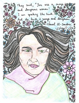 In the first image, the hair is surrounded by a series of expansive lines and, in the second, it is almost interwoven with drawings of plants and flowers. Other artists in the book are equally bold when it comes to affording hair a prominent place in the images. Particularly notable is Lucie Kinchin’s drawing of Angela Davis (Image 4).
  Davis’ afro hairstyle was a deeply political choice that rejected white standards of beauty and dared to take up space in a landscape in which blackness was policed and marginalised. Kinchin acknowledges the political importance and symbolic power of Davis’s hair by allowing it to expand over one quarter of the page. Throughout the book, hairstyles are not depoliticised or dismissed, but rather recognised as powerful forms of self-expressed difference.
Not surprisingly, placards feature prominently in many of the images of the book, especially the ones where protests are being depicted. The placards in the images reaffirm both the Sisters’ political messages of resistance, justice and anti-austerity, and the colouring book as a collaborative medium. In doing discourse analysis, Rose urges us to pay close attention to the relationship between image and text and, in this case, the text on the placards is part of the images (see p. 6, 7, 10, 11, 25 and 48) (Rose, 2016). In the image on page 17 (Image 5, in two parts below), the colourer is invited to write their own message on the placard, an action that makes explicit what is implicit in the other parts of the book – the co-production of images.

However, words written on placards is only one of many ways in which images interact with text in the book. The amount of text varies largely from image to image. In some cases, only one or two words are accompanying the image, including: ‘power’ (p. 13), ‘reclaim space’ (p. 19) and ‘Riot Riot’ (p. 44). Other artists have chosen to name the person being depicted and list a few of their defining characteristics. For example, in her drawing of Frida Kahlo (p. 49), Bethan Morgan chooses to list ‘classic artist, disabled badass, Mexican/Indigenous icon’ under Frida’s name. Many of the images have a quote by the person alongside their portrait.
Such variation brings us to ask ourselves what the quantity and message of the text means in terms of how the audience perceives the image and its featured activist. For us, the short quotes and scarce words create an openness surrounding the women’s biographies and personal histories. With less information in the colouring book, we have a greater urge to research the featured women ourselves. Similarly, the brief bios listed in the glossary give limited information, but also work to quench a thirst for further information about these women, albeit prematurely. Descriptions of a few sentences frame what was previously the expansiveness of this person’s life. On the other hand, we recognise the importance of framing these women’s lives and activism through the Sisters’ ideology, where the diversity and direct-action activism of these women and nb people are highlighted.
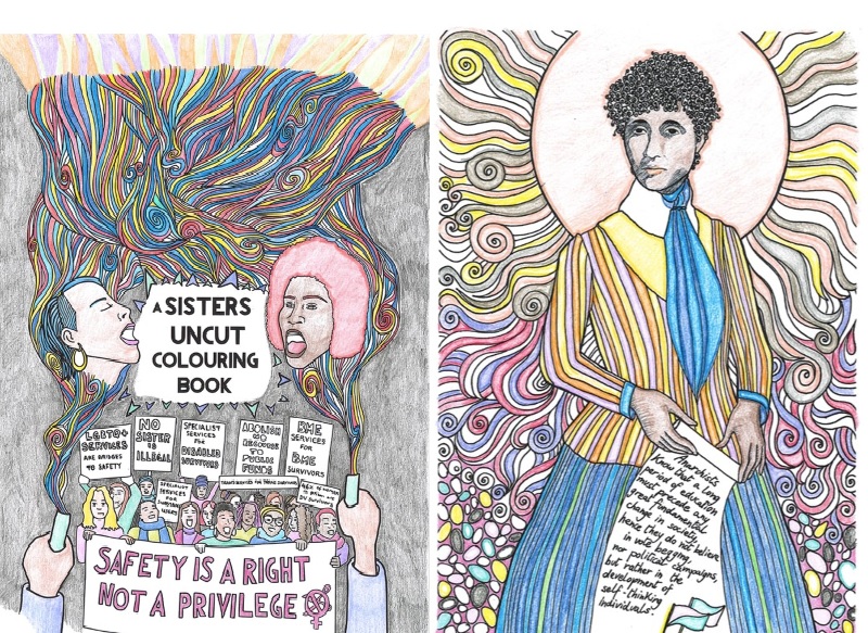
The colouring book images are line drawings. This is both the most obvious and most fundamental observation that can be made about the images included in this collection. As previously mentioned, the lines create spaces for interaction with an audience, for them to colour, and to make something of and ‘become with the book’. Central to the discourse being communicated is the linear intricacy seen in many of the book’s images. Despite the fact that the images are created by a collective of 26 artists, each bringing their own style and experience to the page, the lines throughout have this important, thematic similarity. We are immediately intrigued by the intricate patterns made up of curls, swirls, hatches and dips seen throughout the book. This theme is exemplified and the tone is set by the cover image by Lucie Kinchin (Image 6, below, left.). Apart from a few stand-alone images, which favour simple lines and large blocks of blank space, most of the collection have these intricate lines.
In black and white, these lines are a quirky detail and fulfil the aesthetic tone of the book. However, this theme is most important because of what happens during the colouring process. This type of linear pattern invites the colourer to fill the negative spaces in close proximity with a variety of different colours and shades. Lucy Parson’s coat and skirt on page 36 (Image 7, below, right) can easily become multi-coloured. Likewise, the smoke emerging from the flares on the cover image can become a tangled, psychedelic mess. Colouring small intricate spaces also takes a lot more time than colouring large blocks. For the colourer, a longer interaction with the image can translate to a greater appreciation of the figures depicted in the images. Furthermore, filling these small, adjacent spaces with different colours has several implications for the meaning embedded in the images.
The linear intricacy and how it shapes the colouring, is connected to and reflects the value the Sisters attach to diversity in two ways. Firstly, when many colours are seen beside each other, their differences – even subtle ones – become more pronounced and can be celebrated. Two blue coloured pencils, which at first glance appear to be the same shade, do indeed have subtle differences that make them unique, and this can be recognised when they appear beside each other in an intricate pattern. On the other hand, obviously different colours, varying hues, shades and tones work together in the images to create a mosaic of diversity, like the mosaic of people the book seeks to depict. Secondly, the complexity and intricacy of the lines means that images coloured by different people will end up being more diverse; there are more choices for the colourer to make, and therefore a greater probability that those choices will be different from other colourers. Here, the linear intricacy reaffirms the aforementioned commitment to diversity.
The colouring book generates a discourse around this value, along with identity, strength and political activism that is designed to inspire and energise its audience. However, it is also important to recognise certain contradictions and complexities within the discourse. In the introduction, it is noted that ‘some of those included may not consider themselves sisters’ (A Sisters Uncut Colouring Book, p. 2). This tension becomes most clear when looking through the glossary. The description of Aleksandra Kollantai states her dislike for the ‘feminist’ label and there are likely many activists included, particularly those from the historical past, who would not subscribe to all of Sisters Uncut’s policies. However, rather than silencing these differences, the introduction explains that ‘we welcome and learn from all of them.’ It is the rejection of uniformity or universality that gives the colouring book its discursive power.
Although the colouring book is an unconventional medium for social action, when we take the images and the process of colouring seriously we are able to draw out a powerful discourse. The themes of Sound, Race, Hair, Placards and Linear Intricacy found throughout the book work together to highlight diversity and encourage action.
The Coloured Book
I)
- Working my way through the colouring book has impacted me in two ways. Firstly, and most importantly, it has encouraged me to educate myself further about the lives and work of these activists. That, in turn, has been an empowering process that definitely encourages me to reflect on my own activism and whether I could be doing more. Secondly, I find the colouring a really relaxing and satisfying process.
- While I feel I lack artistic skill in general, building on the work of other artists has allowed me to create work that I am proud of. The images themselves undergo a transformation as the process of colouring proceeds. I have found myself particularly drawn to using pastel colours in ‘feminine’ shades: light blue, purples and pinks. Using these colours on images that are otherwise angry, defiant or powerful creates a juxtaposition that brings up interesting ideas about how emotions are gendered or coloured. Using pink, for example, to colour in the word ‘ORGANISE’ creates a subversive image that further challenges the gendered notion of political leadership.
II)
- I sit down to colour. The cover image of the Sisters Uncut Colouring Book lies before me. After a few test strokes, I become annoyed when my desk’s textured laminate top makes an impression on the page. In a nearby drawer, I find the smooth surface of an old flyer and place it between the page and my desk. It masks the physical connection the image has to my belongings, although I know it is still there.
- I start with the smoke, which emerges from flares on the bottom corners of the page, and become lost in a tangled mess of swirls and lines as it rises. I am met with a decision. Am I to be conventional or subversive in my colour choices, and what would a subversive colour scheme look like? I decide to colour objects in shades in which they are not normally found.
- I settle on primary colours for the plumes, various reds and blues and yellows. There is no method behind where I place each shade. I seek a sort of randomness: colours thrown together, falling where they may. But from a process-oriented perspective, this feels too chaotic. The randomness makes me fear that one colour will dominate. So, I line up my reds and blues and yellows and pick them up in sequence, still colouring the page out-of-order.
- I am feeling quite ‘meta’ about all of the choices I am making. I think deeply about the meanings one might derive from the colours I am adding to the page. And then I realise, or re-realise, because I must have already known, the artist had to make similar choices, but to a greater degree. They started with a blank slate. Choices about line, then choices about colour.
- I begin to second guess the weight I am giving to colour choices. There are surely other colourers who are not mulling over red versus blue to the same extent that I am. On the hand, there are probably colourers who do so to a greater degree. Contemplation seems to add another layer of diversity: different people contemplating, then colouring, in different ways.
- At this stage – audiencing, which means receiving the image – I feel so much a part of the meaning making process. I suppose audiences always are, but in this case, I am also producing.
Bibliography
Flett, J.A.M., Lie, C., Riordan, B.C., Thompson, L.M., Conner, T.S. and Hayne, H., 2017. Sharpen Your Pencils: Preliminary Evidence that Adult Coloring Reduces Depressive Symptoms and Anxiety. Creativity Research Journal, 29(4), pp.409-416.
Gorski, P.C., 2015. Relieving burnout and the “Martyr Syndrome” among social justice education activists: the implications and effects of mindfulness. The Urban Review, 47(4), pp.696-716.
Grierson, J. (2017). ‘Every Refuge will close’: what funding changes could mean for women. The Guardian. [Online] Available at: https://www.theguardian.com/society/2017/nov/26/womens-refuges-funding-changes-what-they-could-mean [accessed, 5 Jan. 2018].
Haraway, D., 1991. Simians, cyborgs, and women: The reinvention of women. London and New York: Routledge.
Mitchell, W.T., 1995. Picture theory: Essays on verbal and visual representation. University of Chicago Press.
Poole, D., 1997. Vision, race, and modernity: a visual economy of the Andean image world. Princeton University Press.
Rose, G., 2016. Visual methodologies: An introduction to researching with visual materials. Sage.
Sisters Uncut., 2016. SAFETY IS A RIGHT NOT A PRIVILEGE (welcome pack). [Online.] Available at http://www.sistersuncut.org/wp-content/uploads/2016/02/SU_Toolkit.pdf [accessed, 26 October 2018]
Authors
Alexa and Tilly have recently graduated from the School of Geography and the Environment at the University of Oxford with an MSc in Nature, Society and Environmental Governance. Their work is focused primarily on environment issues and climate change, and they are also committed to working with feminist principles and approaches. This piece is their first collaborative work and they look forward to pushing boundaries with feminist research practices together in the future.
Images
The introductory image is the Sisters Uncut logo. This shows the symbol for ‘female’, outlined in bright mint green, against a black background. The symbol has a line through the circle and a pair of open purple scissors about to cut downwards into the bottom left corner.
All other images are described throughout the piece, with further details and credits below:
Image 1 – By Lucie Kinchin. Person with mouth open shouting “ORGANISE”. “SISTERS!” is in the top left corner and “SISTERSUNCUT.ORG” is in the bottom right.
Image 2 – By Laura Rivas-martinez. Aleksandra Kollantai with a tangle of colourful hair and rays of light beaming out. The text reads: “The conditions and forms of production have subjugated women throughout human history and have gradually relegated them to the position of oppression and dependence in which most of them existed until now.”
Image 3 – By Laura Rivas- Martinez. Nawal el Saadawi with a lot of black hair surrounded by colourful flowers. The text reads: “They said, ‘You are a savage and dangerous woman.’ I am speaking the truth. And the truth is savage and dangerous.”
Image 4 – By Lucie Kinchin. Angela Davis with an afro hairstyle and hoop earrings with her mouth open. The text reads: “I am no longer accepting the things I cannot change. I am changing the things I cannot accept.”
Image 5 – By Flo. Two images of Staceyann Chin and her daughter, Zuri Chin. In the first, Staceyann is holding up one blank sign and just in front of Zuri is a sign that says “take a stand”. In the second image, orange flames are drawn on the bottom of Staceyann’s sign, along with the message “too much pressure”. Above each picture is the invitation: “What do you want to say? Write your thoughts on Stacyann’s paper.”
Image 6 – By Lucie Minchin. Cover of the Sisters Uncut colouring book (title shown in the middle of picture). Two women with their mouths open above a crowd of people at a protest holding banners and signs. The banners that are fully visible to the editor in this picture include “LGBTQ services are bridges to safety”, “No sister is illegal”, BME services for BME survivors” and (large, at the bottom) “Safety is a right, not a privilege”. The top of the image is filled with a variety of multicoloured lines.
Image 7 – By Marina A.S. Daniele. Lucy Parsons wearing an orange and yellow jacket and long blue and green skirt and surrounded by a brightly coloured patterned background. She holds a scroll that reads: “Anarchists know that a long period of education must precede any great fundamental change in society, hence they do not believe in vote begging, nor political campaigns, but rather in the development of self-thinking individuals.”
